Sunday, May 29, 2016

Nyx Macaron Lippie in Rose

I am sorry about the word lippie in the title of this post, I know that is a neurosis trigger for a lot of people.  However, it is what the tube says and who am I to deny Nyx the joy of upsetting people through the names they give their products?  I am excited to talk about this rather freakish shade of lipstick today that I honestly mostly wear as a cream blush and have never managed to get out of the house wearing on my lips.


The packaging is typical Nyx black plastic with white writing and a clear middle portion that allows you to see the color inside. 


The bottom shows the innocuous name "Rose" which might lead you to expect something nice and pink and wearable.  There are certainly a lot of wearable rose lip colors.  This is not one of them.  While it may look like one of the more wearable out of the Macaron line, this is anything but subtle.  It isn't a pistachio green or a concrete grey, but it is almost more jarring as it is close to being a shade found in nature.  As you can see in the context of my face, it is an alarming pastel shade of bubble gum pink.  


The packaging is pretty cheap feeling, but is functional.  The bullet rolls all the way down into the packaging, which is a plus so my clumsy self will avoid nicking it with the cap.  The only real flaw is there is no "click" to start rolling up so I can see myself managing to squash the bullet against the inside of the cap.


Here is a swatch of it looking all lonesome on my arm.  I gave this a couple of swipes to get the color opaque.  Because it is so bold any patchiness becomes very obvious.  

1


Below it is swatched in context of some other brighter pinks and purples in my collection.  None are quite as white based as Rose, but the Posietint  is maybe the closest in shade.  Top photo is without flash, bottom is with. 
Top to bottom: Pixi Shea Butter Lip Balm in Pixi Pink, Nyx Macaron Lippie in Rose, Laqa & Co Lip Lube in Menatour, Benefit Posietint, Benefit Lollitint, Benefit Lollibalm

It took me quite a few layers and a lip brush to get this applied the way I wanted but I ended up with a decently smooth result.  It felt thick on the lips, very noticeable, but it did not seem to dry them out. There is a thicker deposit of product on the left side of my bottom lip that looks a little off and applying straight out of the bullet was hard to define my cupids bow.  


The makeup I was wearing on the testing day was quite warm, which only assisted in making it look like my lips were floating on my face.  I think if I had been wearing a more cool-tone face of make up the look would have been slightly more cohesive.  That being said, this shade will never be subtle so I got some enjoyment out of playing up the white and blue in the base.  


The color stayed on my lips very well for an hour of just sitting and reading.  I did not eat or drink during that hour.  At the end you could see that the lipstick was starting to settle a little more obviously into the cracks of my lips.  This is not that surprising given how creamy the formula of this is, there is borderline too much slip for it to be trustworthy.  I suspect a drier formula would not give you such a bold color.  This settling also was not that obvious in the context of my whole face.  


After about an hour I got thirsty and drank a glass of water, that was left with some nice lipstick prints.  The transfer from this lipstick is super obvious, if not surprising given the creamy formula.  It also looked a little bit worse for wear following the water, no obviously bald patches but generally more sheer toward the center of my lips.


By the two hour mark I had also eaten a handful of candied ginger and my lipstick was showing quite a bit of wear.  You can see the bald patches on the left side of my mouth and that it was quite obvious even in the context of more of my face.  


Overall I don't hate this lipstick, I think the look it creates is interesting.  I just have found it too unusual to wear out into the world.  I have worn it a few times as a cream blush, but requires an awful lot of blending and probably wouldn't work on anybody with a darker skin tone than I due to all the white in the base.  
Otherwise nondescript makeup with the nyx macaron as a blush


I think this shade of lipstick would look absolutely stunning on somebody with a darker skin tone, but again it would not look any more natural.  Maybe sometime this summer I will get up the courage to be one of the cool kids and wear this so other people can see.  


Friday, May 27, 2016

So Whatever Happened with That Palette?

So casually six months late I am going to post a wrap up for my pan that palette project from 2015.  I am nothing if not a timely woman.  I ended up finishing 4 shades out of the palette and although I hit pan on the transforming ribbon it irritated my eyes too much for me to ever want to use it again.  I had also used up a fair bit of the single shadow in "Bone" from Ulta.   


The offending glitter bomb.

Many of the shades in the palette had a lot of love and little baby dips going in them.  

Examples of a few dips in shades that I really did like.  

Other shades were clearly less loved and still had the embossing on them.  I am accepting that I am not a fun shadow lady.  I am a boring lady.  

I was just never really very sure of what to do with a navy besides occasionally lining my eyes.  And never enough to make even a slight dip.  

I tried very hard in the last month to hit pan on Miracle, but unfortunately that never happened.  Although I did manage a rather deep dip dug right into the center.  This was an odd shade to me, in that it looked very reddish and cranberry-like in the pan, but on my eyes was almost grey.  


Overall I was pleased with the progress I had made using the palette almost exclusively for a year, but I was also very much ready to not use it again for awhile.   The palette had mostly just transition shades remaining, but they were perfectly fine shadows for the most part and I didn't want to just throw them away.  I have seen lots of people depotting shadows and watched many a tutorial out of curiosity, but I didn't have a Z palette and didn't really want to buy one.  Plus, I liked the sturdiness and bright holographic packaging of the house they were in.  So I embarked on a repressing journey with some Ulta singles, and also took the opportunity to gouge out that irritating glitter and replace it with a more usable shimmer shadow.  

I did all of this on a paper towel because I am a giant mess and this made an easy clean up at the end.  


I wanted to press in the shades "Bone", "Camel", and "Bermuda Sands" from Ulta singles.  This plan also gave me the chance to get these out of their bulky singles packaging and into a palette where I could use them to create a cohesive look more easily.  


The first on my list was "Bone", as a palette is useless to me without a cream base color to set my primer and use to blend out.  I had been using "Bone" during the project anyway after the original cream shades in the palette were used up.  


I crushed up the shadow in its original pan to create a fine powder, the put that powder into the It Cosmetics palette pans.  I ended up having enough shadow left to fill two of the pans in the palette, rather than just the one I was expecting.  


Then I dumped some isopropyl alcohol on the powder and pressed down gently with a paper towel.  This kept me from getting my fingers and all the gunk on them into the new shadow as well as helping to soak up some of the excess alcohol.


As you can see, there was a lot of alcohol for the towel to soak up.

All pressed
Next I crushed up "Camel".  I was using a pen cap that I had dipped in alcohol as it was sharp and I didn't care about throwing it away after it became gross from all the shadow.  I know a lot of tutorials recommend a butter knife or the like, but I just didn't want to deal with the clean up.  


About halfway through breaking up, still too chunky to repress.

Here it is a fine enough powder to use.

I poured enough alcohol on top to make them really wet and pressed them with the paper towel as shown before.

A lot of shadow ended up being pressed outside the pan as well, but ws easy to clean up with a Q-tip after I was all done.

I went through the same steps with "Bermuda Sands" going into the larger pan that previously held the glitter itch disaster of supposedly transforming magic.    

Powder pile

Pressed with alcohol

In the end I was pretty happy to have taken a palette that was beat up and well used and turn it into a new customized palette.  I haven't used much of this palette in the last couple of months, as I have been enjoying playing with my other shadows, However, I like knowing that I could use this palette to make a full look again with the shades in it now and will likely use this a travel palette for some trips coming up this summer.  Below is the finished product with and without flash.  I am pretty pleased with how nicely it turned out and very much like this as an alternative to mismatched pans of shadow in a Z palette.


Sunday, April 3, 2016

Nail Call: Q1 2016

Basically no sunlight in the evening means no blogging because I can't take good pictures of wear time.  Here is what I've been wearing on my nails for the last three months though.  I aim to wear every single nail polish I own this year, which is going to take some doing.  I refuse to enter 2017 with a shameful pile of untried polishes mocking me.  I am going to cull as I go and try to give brief ratings or thoughts on each polish.  Also: I still think the hold things pictures are funny.  Please laugh along with my childish amusement.

Zoya "Brigitte"

10/10 would recommend.  I started the year off with a bang, an untried polish that I think is still probably my favorite so far.


Julep "Elaina":

This was fine, but I am on the fence about it.  It is blue for grown ups.  I will keep this one, but I don't need that many of this shade of blue.  


Zoya "Cosmo":

I don't often want a glitter, but when I do, I could probably use the most glittery glitter that ever glittered.  Keeping against my more practical judgement.


Julep "Cassie": 

This was very sheer and took 4 or 5 coats to build up to an opacity I was comfortable with.  I am going to keep it because I like the end result, but I am putting it in a project polish to use up in 2017.  


Zoya "Charli":

I love the idea of an olive nail polish but I just didn't find this flattering or interesting.  I think it needs a little more yellow.  This is being released back into the wild (put into a box to be sifted through by friends/family).


Julep "Isabella":

This was a great bright, vibrant blue.  I will definitely be keeping.  


Sinful Colors "Nirvana": 

Bordering on boring but a nicely professional color.  I will be holding onto this.  


Julep "Claudette":

There is something muted and brick-ish about this red that makes it more wearable and less 50 year old in leopard print doing her.  I will be holding onto it and remembering that I don't need that many more reds.  


Zoya "Wendy":

This is ridiculously bright, but it's also fun.  I will have to wear it sparingly but I don't mind it sticking around in my collection for now.  It was also pleasantly smooth for such a bright color, which tend to go a little streaky.  


Nina Ultra Pro "Sugar Spun"
This is an alright nude for my skin tone.   I don't love the tiny shimmers in it though.  This will also go into next year's project polish to be used up.  


Color Club "Gold Struck":

While this is a very good metallic, I am not a fan of metallics.  I should not have purchased this shade and will be releasing it into the wild to find a better home.  


Julep "Layne":

This is obviously quite sheer.  Because I constantly wear polish my nails tend to be quite stained so I can't wear them just bare.  I like having polishes like this to give the illusion of healthy bare nails though.  I will be holding onto this.  


Julep "Abigail":

This is one of their silk finishes, which are lightly matte.  It makes me appreciate the metallic finish a lot more and I will be holding onto this polish.  


Julep "Fifi":

Layne's less sheer cousin.  I will be keeping this one.


Nails Inc "Oxford Street": 

This is just a tough brown for me.  It is lighter and more yellow in the bottle than on the nails so I avoid reaching for it.  I actually think once I get it on my nails it looks quite nice though.  I will keep this and put it in next year's project polish so I am forced to use it rather than let it languish looking like baby poop.  


Zoya "Kendal":

I am a big fan of this  interestingly neutral polish and will be holding onto it.  


Julep "Rayma":

This is fantastic although I do think it made my nails quite yellow.  It may have to be reserved for toenails (it luckily is my favorite type plummy purple to use on my toes) or used with double base coat.  It stays for now though.


Julep "Mona":

I took an awful lots of photos of this polish, but unfortunately I am just do not like it enough compared to what else I have been wearing so far this year.  I am releasing this polish into the wild.  As a side note, I also very much dislike the Peter Thomas Roth Cucumber Gel mask I am holding in these photos.  


Note pictured, Julep "Margaret": A nice light grey-blue I am holding onto. 

Zoya "Perrie":  This satisfies all of my radiant orchid needs.  Or at least checks all the boxes to satisfy them but who is to say if I will ever have enough radiant orchid in my life to be satisfied.  In good news my african violet is flowering again with flowers that are almost the exact shade of Perrie, which I will be keeping.  


Nine Ultra Pro "Blue La La":

This is a nicely muted blue but it runs a little blah.  I will be putting it in next year's project polish to try to use it up.   I am also motivated to use it up because it is quite old (at least 5 or 6 years).  I am not sure if the bottles/brushes are still the same, but I will mention that the Nina Ultra Pro brushes are wonderfully short and wide.  I really enjoy painting my nails with them.


Zoya "Paige": 

A slightly brighter version of Julep "Rayma" I also really like this shade.  It seemed to stain my nails a little less than Rayma.  


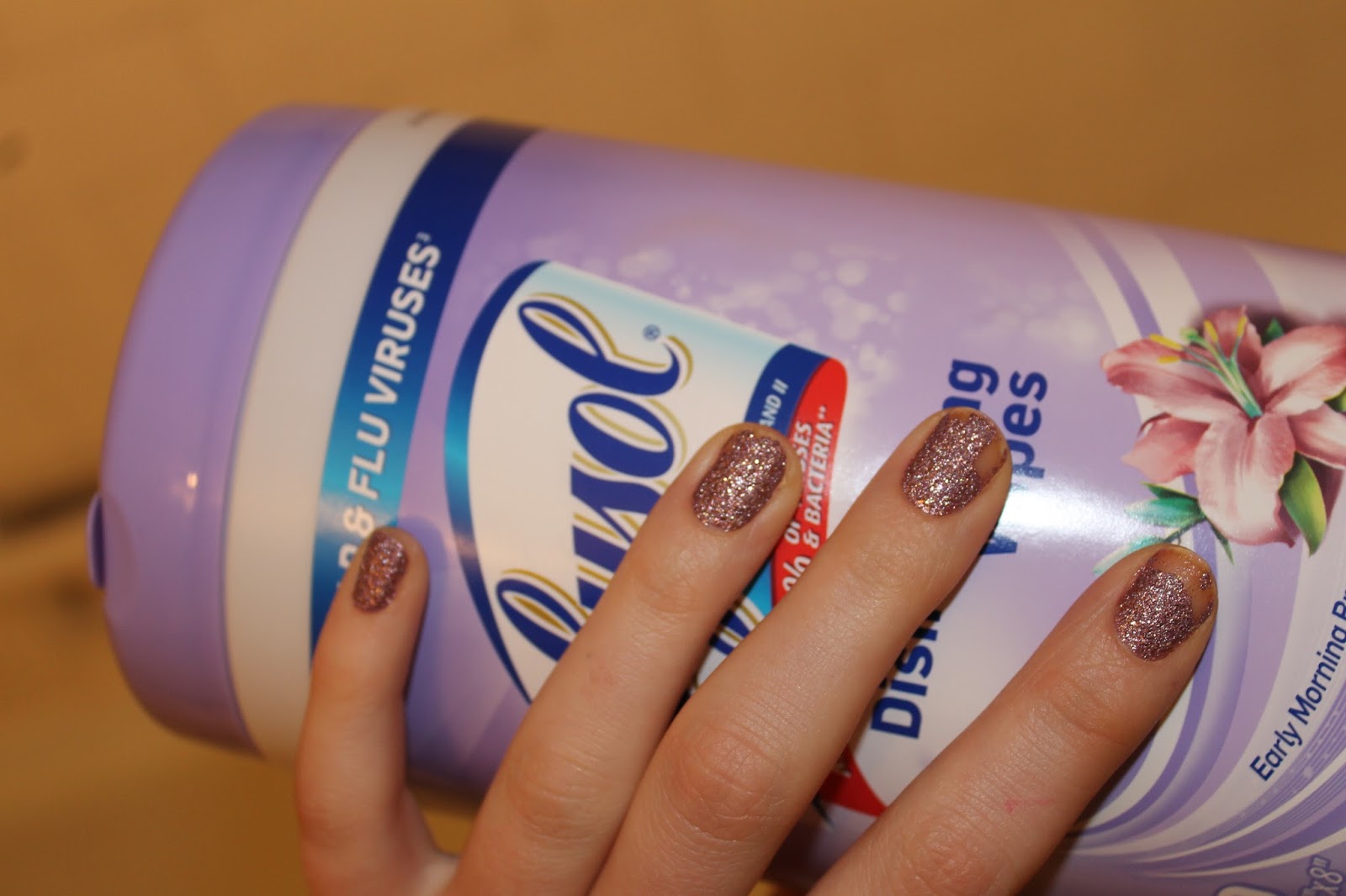
Formula X "Intergallactic":

This is obnoxious pink textured glitter and I kind of love it.  It's not subtle and it's not really appropriate for professional situations, but it sure is fun.  I am going to hang onto it because it actually wears pretty well (the pictures below show it after over 7 full days of wear).  


OPI small mystery polish:

This came as part of a set in a gift with purchase and I have absolutely no idea what the shade name is.  I liked this fine for a slightly healthier nail look and will hold onto it.  


Sinful Colors "Gogo Girl":

This is a good example of a red that just isn't for me.  I did not feel like myself for the entire time I was wearing this, like I was trying too hard to be loud and sexy.  Released into the wild for this one.


OPI "Taupeless Beach":

I bought this to try to dupe an old favorite I used up (Julep "Alaina") and am pleased with the results.  It is an interesting neutral that leans both grey and purple to provide some depth without being leaving the realm of appropriately professional.  


Zoya "Miley":

I love the end result I got with this, but I was disappointed in how thin the formula was.  Below is 5 or 6 coats to build up to that opacity.  I will be putting this in my project polish to try to use it up, perhaps over a white base.  

So there you have all of my nail polish adventures.  More to come in 3 months with hopefully/maybe a handful of blog posts in between.